Documentation Index
Fetch the complete documentation index at: https://companyname-a7d5b98e-feature-fumodocs.mintlify.app/llms.txt
Use this file to discover all available pages before exploring further.
@ton/appkit-react exports ready-to-use components for the most common AppKit flows. Drop them into your tree and connect callbacks. The default styles ship in @ton/appkit-react/styles.css.
How it works
Widgets are React vertical flows over the same AppKit instance, selected wallet, network, and providers used by hooks and core actions. They are not a separate design system. Use the default UI when the built-in flow fits. Use render props when the widget should keep AppKit state and behavior but the app owns layout. Use hooks directly when the product flow no longer matches one component.Before you begin
You need the React providers mounted and the styles imported once at the entry file. See Installation → Wrap the application.Component catalog
| Component | What it does |
|---|---|
<TonConnectButton /> | Drop-in connect button. Opens the TON Connect modal and shows the address. |
<Send /> | Generic transaction submitter. Accepts a request factory. |
<SendTonButton /> | Toncoin transfer with recipientAddress, amount, comment. |
<SendJettonButton /> | Jetton transfer. Takes a jetton descriptor plus the same transfer fields. |
<TransactionProgress /> | Renders the lifecycle of a sent transaction. |
<NftItem /> | NFT card with image and metadata. |
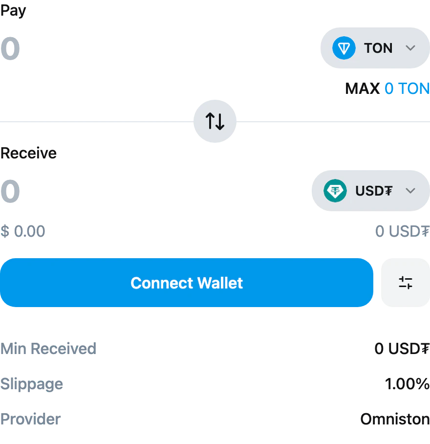
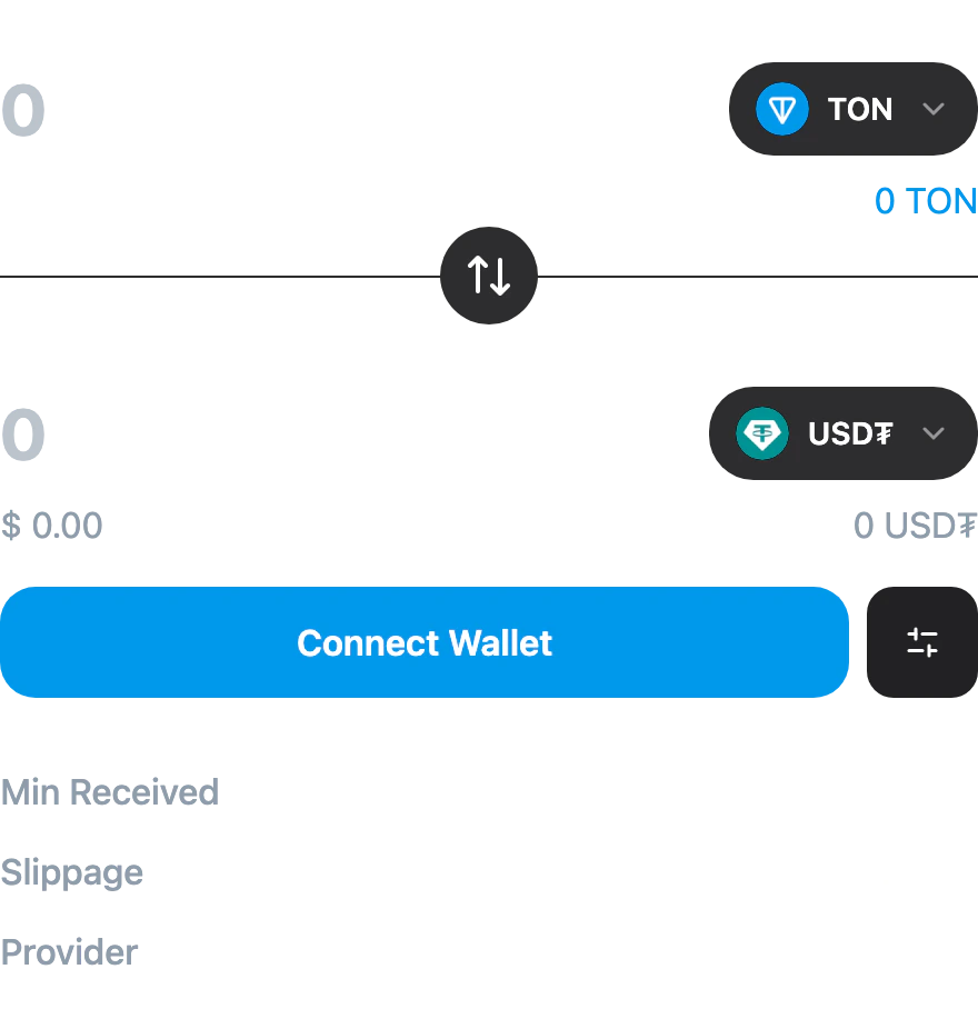
<SwapWidget /> | Full swap UI: token select, amount, slippage, settings, submit. |
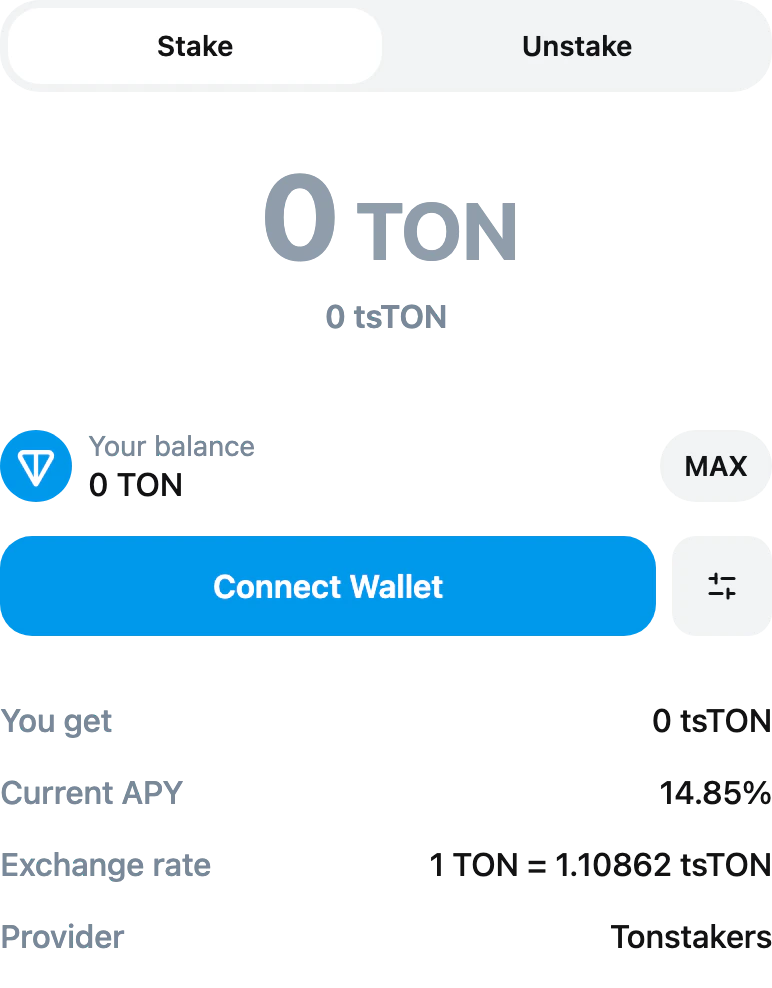
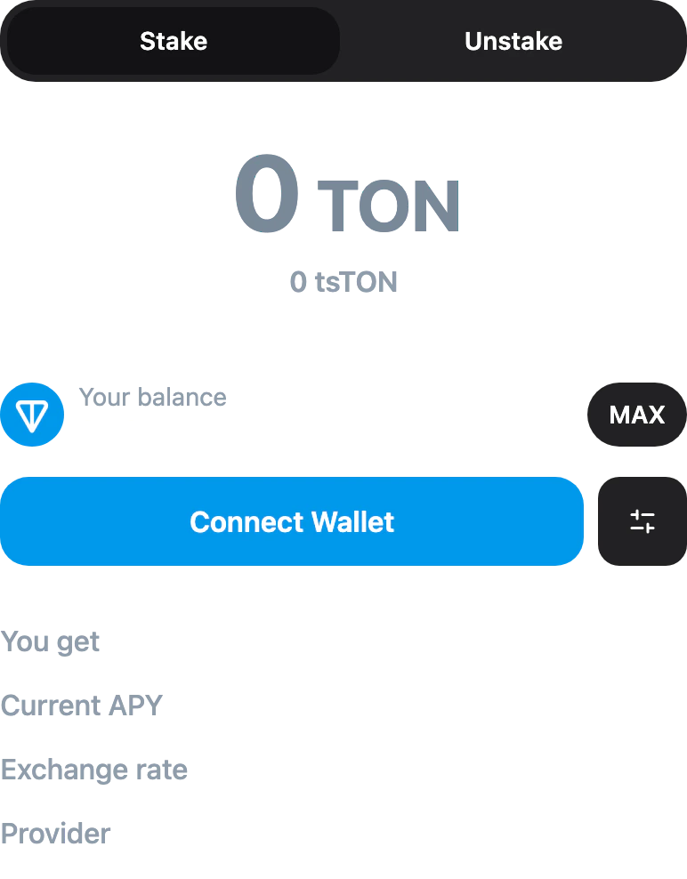
<StakingWidget /> | Full staking UI: stake/unstake tabs, amount, APY and exchange-rate readout. |
<TonIcon /> | TON logo glyph as an inline SVG. |
<TonIconCircle /> | Same glyph framed in a circle background. |
Connect button
Send Toncoin
Send {amount} TON. Pass a children render-prop with { isLoading, onSubmit, disabled, text } if you want to drive a custom button — the component still owns the request, the call to the wallet, and the loading/error state.


Send a jetton
<SendJettonButton /> mirrors <SendTonButton /> but takes a jetton descriptor with the master address, ticker, and decimals so it knows which jetton wallet to call.
jetton.address, jetton.symbol, and jetton.decimals are all required. The default rendering shows Send {amount} {jetton.symbol}; pass a children render-prop if you want to drive a custom button.


Send a prepared transaction
<Send /> accepts a request function that returns a TransactionRequest. Use it for transactions you build yourself (offline builders, swap quotes, NFT transfers). Set text to label the default button.
children render-prop with { isLoading, onSubmit, disabled, text } instead of (or alongside) text if you want full control over the button markup.


Render an NFT
Swap widget
<SwapWidget /> is the complete swap UI: pay/receive fields, token selector, flip button, slippage settings, and the submit button. Pass the list of tokens the user can pick between, optionally seed the default pair, and the widget handles quote fetching, building, and the wallet call internally.
tokens. defaultFromSymbol, defaultToSymbol, defaultSlippage (basis points, default 100 = 1%), fiatSymbol (default '$'), and network (defaults to the connected wallet’s network) are all optional. Pass a children render-prop to replace the default UI while keeping the widget’s internal state — the function receives { fromToken, toToken, fromAmount, toAmount, isQuoteLoading, canSubmit, setFromAmount, onFlip, ... }.
Staking widget
<StakingWidget /> is the complete staking UI: stake/unstake tabs, amount input, balance readout, current APY, exchange rate, and provider. The widget reads the registered staking provider (Tonstakers ships bundled — see Providers → How they are registered) and handles quote, build, and the wallet call internally.
network is the only prop; pass it to override the connected wallet’s network. Pass a children render-prop for a custom UI; the function receives { amount, quote, isQuoteLoading, canSubmit, setAmount, direction, setDirection, unstakeMode, setUnstakeMode, ... } to drive your own controls against the widget’s internal state.
Show transaction progress
After a send call resolves with aboc, hand it to <TransactionProgress /> to render the wallet → chain lifecycle UI.
children render prop. The child receives { status, totalMessages, pendingMessages, onchainMessages, isFetching, error, boc, texts }. For lighter customization, pass classNames={{ container, icon, message }} to restyle internal parts without owning the markup.
TON glyphs
<TonIcon /> is an inline SVG of the TON diamond; it follows the surrounding color (so it tints with currentColor). <TonIconCircle /> is the same glyph framed in a circular background. Both accept an optional size (defaults to 16).
Common props
The send components share a callback shape:| Prop | Type | Notes |
|---|---|---|
onSuccess | (response: SendTransactionResponse) => void | Response carries boc, normalizedBoc, and normalizedHash. |
onError | (error: Error) => void | Plain Error. Pair with getErrorMessage for UX-safe text. |
disabled | boolean | Disable the underlying button externally. |
| children | (state: { isLoading, onSubmit, disabled, text }) | Render-prop API for full styling control. |
text | ReactNode | Label rendered when no children render-prop is provided. |
Code example
See a working example that integrates<SwapWidget /> and <StakingWidget /> — try it live.